
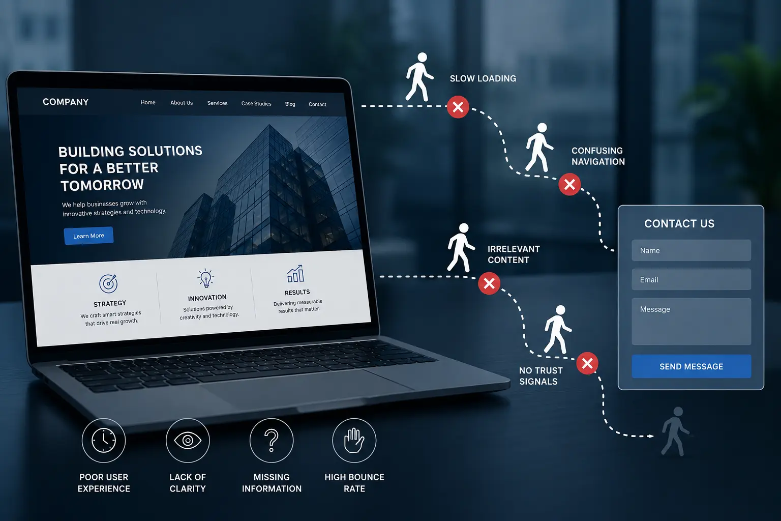
Several months ago I was discussing the performance of a website of one of my friends. He operates his own logistics business. And he was upset because even though the website was really good – well-designed and professional-looking, as expected from such a serious organization, the leads weren’t coming in. “They visit our website,” he told me, “and then just vanish into thin air.”
We checked out the website together. I quickly understood why.
The homepage had a slow slider section full of unoptimized stock images with a great slogan, but totally irrelevant. Anyone arriving at this page couldn’t understand what the company does, who it works with, and how its services might be beneficial to them.
That is exactly when the disaster strikes. Not at the point of contact form. Much earlier. Here’s the part people forget. Someone landing on your website is making a snap decision, almost without thinking about it. Can I trust these folks? Do they get my problem? Should I bother reaching out? If your site doesn’t answer that fast, the visitor’s gone. No second chances.
Slow loading is a quiet killer too. My friend’s site took six seconds to load on mobile. Six. Half his traffic was on phones, and most of those people had bounced before the page even finished. He’d paid a fancy website development company in Saudi to build something beautiful, but nobody had asked whether it was actually fast.
Then there’s the wall-of-text problem. Companies love talking about themselves. Our history, our values, our award-winning team. Visitors don’t care about any of that yet. They just want to know if you can solve their thing. When every page reads like a brochure written for the CEO, people tune out.
Navigation trips up a lot of sites as well. I’ve seen menus with fourteen items, dropdowns hiding inside dropdowns, page names that only make sense to the folks who work there. A confused visitor doesn’t email you for help. They close the tab.
And trust signals, or the lack of them. No real photos. No client names. No case studies. A phone number you can’t actually find. A pretty design on its own won’t convince anyone. People want proof you’re real, and that other humans have worked with you and come out fine.
So what fixes it?
Clarity, mostly. The second someone lands, they should know what you do and who you help. One sentence. Plain words. Skip the poetry.
Speed matters just as much. A good website designing company Saudi businesses lean on will obsess over load time, not just the way things look. If they never bring it up, that’s a red flag worth noticing.
Cut the clutter while you’re at it. Fewer menu items, shorter paragraphs, buttons that tell people exactly what happens when they click. And scatter proof everywhere you can. Logos, a testimonial or two, real numbers, a face. Small stuff, but it adds up.
My friend made these changes over a few weeks. Nothing dramatic. He simplified the homepage, cut the load time roughly in half, added some client logos and a genuine “here’s what we do” line near the top. Within a month his form submissions had almost doubled. Same traffic. Same form. Just less friction on the way to it.
The contact form is rarely the real issue. By the time someone reaches it, the decision is mostly made already. Everything before it is what does the convincing, or the losing.
So if your numbers feel off, don’t start by fiddling with the form. Walk through your own site like a stranger would. Better yet, sit behind a few people while they use it and stay quiet. The leaks tend to show up quick. And if you’re paying digital marketing agencies in Saudi to send you traffic, make sure the site catching it can actually hold on. Filling a leaky bucket is a rough way to burn a budget.
Fix the path first. The form will take care of itself.