
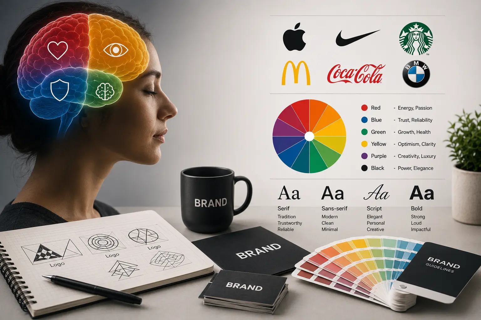
A logo isn’t a picture. Most business owners treat it like one pick something that “looks nice,” move on. But what’s actually happening is closer to a psychological trigger than a design choice. Shape, color, font, all of it is sending a signal to someone’s brain before they’ve even gotten to your tagline, and that part rarely gets talked about. Trust, it turns out, isn’t something people decide on. They feel it, almost instantly, long before logic gets a say.
Color is where this shows up the clearest, and also where most brands get lazy. Take red fast food chains didn’t pick it by accident. It triggers urgency and hunger in a way almost no other color does. Yellow works differently; it grabs attention fast and reads as optimistic, though push it too far and suddenly it looks cheap instead of cheerful. Green sits somewhere in between, tied to growth and nature in one context, money in another, depending on which culture you’re talking to. None of these are stylistic preferences. They’re shortcuts straight into how someone feels about a brand before they know anything about what it actually sells.
Shape carries its own weight too. Round logos tend to feel friendly, a little softer, more approachable. Sharp, angular ones lean serious, sometimes aggressive. Walk through any luxury brand’s visual identity and the pattern repeats clean lines, minimal curves, generous negative space. Nothing about that is random. It’s a quiet way of saying “premium” without ever printing the word.
Typography gets skipped over the most, which is strange given how much weight it carries. Serif fonts, the ones with the small feet at the base, lean traditional and established. Drop the feet and go sans-serif, and suddenly the brand feels current, digital, stripped down. Script fonts shift the tone again, toward something personal or upscale. The font isn’t neutral. It’s setting the voice of the brand before a single word gets read.
Where it gets genuinely interesting is when these elements collide. Take that same bold red, but now put it inside a sharp, angular shape paired with a heavy sans-serif font the message shifts entirely compared to soft, rounded red paired with a script font. Same color, different psychology, because context does most of the heavy lifting here. Strip away the strategy and just stack “nice colors” with “a cool font,” and the result usually looks fine for about five seconds and means nothing five years down the line.
That gap is exactly where a brand identity design agency earns its keep. Not by making things prettier, but by engineering a consistent feeling across every touchpoint a customer runs into website, packaging, social, signage so the psychology actually supports the business instead of working against it by accident.
Dubai complicates this further. Old-money luxury sits a few blocks from disruptive new startups, global franchises compete directly with local heritage names, and the audience here has seen every branding trick in the book. A brand identity agency Dubai businesses actually rely on isn’t just producing logos. It’s reading a saturated, visually competitive market and building something built to cut through the noise rather than add to it.
There’s no shortage of branding companies in Dubai promising the perfect logo, either. But perfection was never really the goal strategy was. A logo that’s beautifully designed but psychologically off for its audience hasn’t succeeded just because it looks good. It’s failed, just at a higher price point than usual.
So before signing off on the next logo, palette, or font pairing, the real question is simpler than it sounds: what feeling does this put into someone’s head in half a second? Without a clear answer, that’s not branding happening. It’s decoration wearing branding’s clothes.