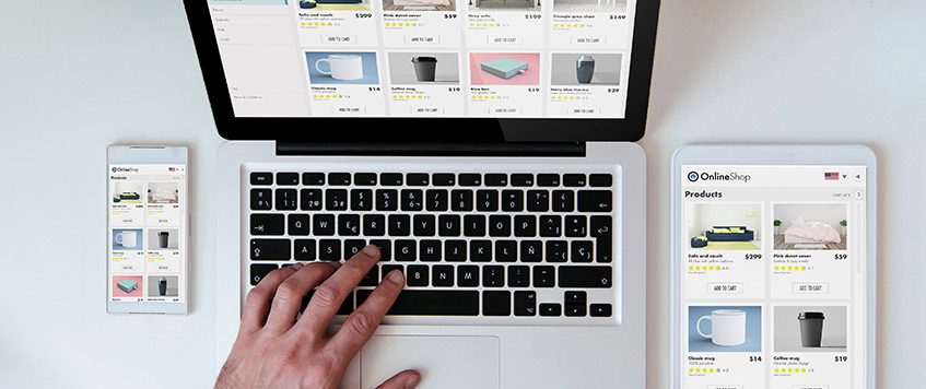
The introduction of the digital world has changed how consumers shop. With any business that has a website, it is first a store front, and then it is a salesperson. Every E-commerce business has to understand that while website design can be pretty, a good design is one that generates revenue. A good website design will generate trust, and help users funnel toward a purchase while eliminating and counteracting abandonment of the shopping cart. In contrast, a bad or aged website design is a liability. It communicates unprofessionalism, causing users to abandon purchases. It is also why users will choose competitors. Out of everything, the prioritization of design strategy will be one of the most complex and effective ways to distinguish from others in the complex digital world.
1. The Revenue Driver: E-commerce Web Design
The design strategy behind E-commerce web design can either make your conversion rates skyrocket or make them plummet. Consider the thoroughness that goes into the web design; every little thing matters, and from how easy your web design navigates to how high the ‘Buy Now’ button is, is how professionally engineered it is to make sales. Customers are impatient; they don’t have time for slow web loads and checkout processes that may confuse them, so the design keeping ‘looking good’ for a website goes from that to conversion focused ecommerce design. This design is all about how to make certain that the user feels stress free at every step along the way to purchasing the product; they need to feel like there is little work involved in finding the product, understanding why the product is important for them to have and finally, completing the purchase.
| Design Element | Primary Goal | Impact on Sales |
| Visual Hierarchy | Guiding the user’s eye | Ensures attention is drawn to CTAs and promotions. |
| Mobile Responsiveness | Seamless cross-device experience | Eliminates friction for the majority of UAE shoppers (mobile-first). |
| Product Page Layout | Providing necessary information quickly | Reduces uncertainty and encourages the “Add to Cart” action. |
| Trust Signals | Building credibility (badges, reviews) | Increases buyer confidence, especially for first-time purchases. |
2. Improving User Experience (UX) on E-Commerce Websites
Often the deciding factor with regards to a website visitor finishing a transaction versus leaving a website is the level of quality present in the E-commerce site user experience. At this point, an ECommerce website development company in Dubai would come in handy. They appreciate how a visitor’s journey is seldom linear and attempt to streamline and simplify key pathways in order to save time and ease frustrations in critical areas like these:
- Main Page: Should convey brand worth and allow access of the other pages with the time least possible.
- Item Pages: Must have multiple reviews, stock levels, competitive pricing, and quality images that show the item from multiple angles.
- Purchase: Needs to show no more than two pages of content and request no more than the bare essentials. Should not require the user to set up an account to complete the purchase.
Neglecting to optimize these aspects directly leads to cart abandonment and design flaws. Such design flaws can lead to companies losing millions in revenue.
3. Web Design that Builds Trust and a Brand
A site with a cohesive layout and seamless functionality builds trust and reflects on the brand. On the other hand, glitchy sites and amateur design can lead to an impression of operational instability. This can hurt the brand’s trust and perception, especially when consumers are asked to submit sensitive payment information.
Good web design helps the customer to trust the business offer and to take it seriously. It shows the credibility and reliability of the business. In the UAE, where the digital market is growing, credibility is even more important. The design shows the customers that “we are a real and safe business.”
Conclusion
For any business that operates in the digital market, web design is the basis of every transaction. The design should be aimed at converting customers whatever the detail from product image gallery optimization to a seamless checkout.
To guarantee that the design of your online store delivers maximum sales and exceptional customer experience for the competitive market in the UAE, the ideal choice is a vendor with design and digital strategy expertise. A digital marketing agency in Dubai can help you in the design of your website from a passive catalogue to an active functioning sales tool.
How to increase your conversions and reduce your cart abandonment? Get in touch with RedBerries for a consultation to discuss your next E-commerce web design strategy!

