
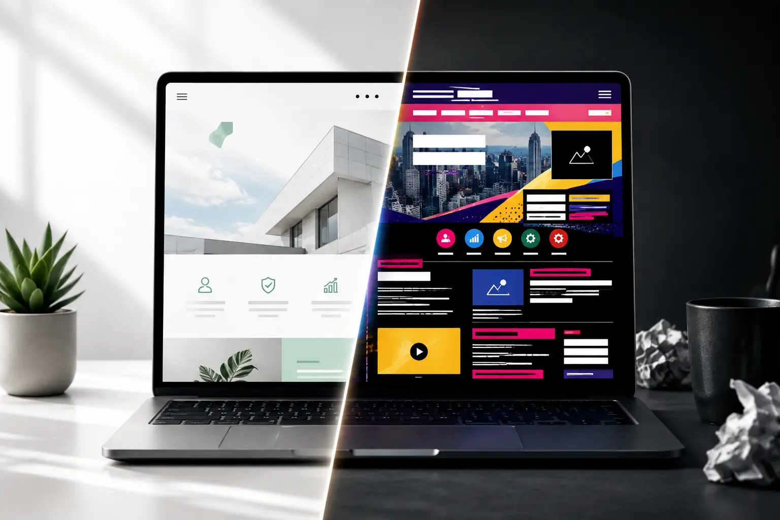
Most websites are built as monuments.
A monument to the brand. To the rebrand. To the designer’s portfolio, the CEO’s favorite color, the agency’s award submission. Big hero video. Twelve navigation links. A font for every mood.
Here’s the thing nobody wants to hear: your visitor didn’t come to admire your monument.
They came to get an answer, a product, a phone number and leave. Your website isn’t a monument. It’s a door. And most “design” is the designer standing in the doorway.
The one question that settles every argument
But before we discuss any dos or don’ts, there is one test that will solve almost any design dilemma you could ever have.
Does it help the user achieve their objective or does it make me feel good about my site?
This is the whole story. This is all there is to it. Run this test on all the elements on your website: the autoplay video, the intelligent menu system, the third font, the stunning yet sluggish picture. It all comes down to whether it serves the user or serves you.
Sites that perform well pass this test with fanatical devotion. Everyone else fails this test and calls it “creativity.”
This is the origin of all good website UX best practices.
What high-performing sites do
They map the path before they decorate it. Before a single color is chosen, the good ones know exactly how a visitor gets from “just landed” to “did the thing.” A site is a journey, not a gallery. User experience begins with the journey and then comes the landscape, not the other way around.
They choose a path and stick to it. Typography limited to one or two typefaces. Careful selection of colors. Uniform design from page to page. Consistency is not dull; consistency means that you don’t have to teach your visitors about your website all over again. A brand that speaks in twelve visual voices says nothing.
They make it fast. This is the least glamorous of the modern web design tips and the most decisive. A visitor will forgive a plain page; they will not wait for a beautiful one. Compress the images, cut the bloat, and earn the speed because the most elegant design in the world converts nobody who has already left.
They design for the thumb. Most of your visitors are on a phone, holding it in one hand. The high performers design that experience first and let it grow up to the desktop not the reverse.
What they don’t do
Now the design mistakes to avoid and notice they’re all the same mistake, wearing different costumes.
They don’t make you hunt. The cardinal sin is clutter. Too many links for navigating, too many options to choose from, too many elements on the screen. Make your menu concise with just a few links, not a telephone directory, and have the footer do the rest. Each added item is a toll on the user’s attention.
They don’t shout in twelve voices. Too many fonts, too many colors, too many things all begging for the eye at once. Color carries meaning; spend it deliberately. A page trying to say everything ends up saying nothing, loudly.
They don’t mistake decoration for design. A spinning logo is not designed. A parallax-scrolling, auto-playing, mouse-trailing showcase is not design, it’s the designer performing. Design is the invisible work of making the right thing obvious and the next step easy. If visitors notice your design more than they notice getting what they came for, the design failed.
It is not going to be shipped without testing. It should be tested, tested, and re-tested on an actual phone, an actual browser, and as an actual impatient stranger. The stranger is going to discover your broken link, your submission problem, or your disappearing button on mobile.
Conversion isn’t added. It’s uncovered.
This is how everything can come together.
Conversion-focused design is seen as an extra piece that can be slapped on after a bigger button, a pop-up, or a countdown timer. It isn’t. What’s left after everything else has been stripped away to achieve the goal of the visitor is conversion.
You don’t add conversion. You subtract friction. Every confusing menu you simplify, every slow image you compress, every needless step you delete that’s a conversion optimization, even though it looks like deletion. The highest-converting sites aren’t the busiest. They’re the clearest. They got out of the way.
A preview from the front: the UAE
Some trends in web design in UAE illustrate the level to which standards are being set.
For the rapidly changing, mobile-driven, multi-language environment, it’s the websites that marry style and efficiency and make sure that their offerings can be appreciated by the thumb-tapping browser who doesn’t have a lot of time on his hands. Form and function are two sides of the same coin here. This is a great glimpse into the future of web design.
So here’s the move
Open your own site. Pretend you’ve never seen it and you’re in a hurry.
Can you get what you came for in seconds, on a phone, without thinking? Or do you have to hunt, wait, squint, and guess? Be honest. Then start deleting the extra font, the slow video, the menu item nobody clicks until only the path remains.
The best websites in 2026 won’t be the most impressive.
They’ll be the ones that got out of the way so completely the visitor forgot there was a website at all and just got what they came for.
That was always the job. Design was never about being noticed. It was about making the right thing effortless.
FAQ
What are the most common web design mistakes businesses make?
All of these problems arise due to the requirement of giving priority to the branding rather than the visitors. The common problems are as follows:
- Clutter and navigation overload which make the visitors look for things.
- Too many fonts and colors that distract the visitors.
- Slow loading of the website as a result of the usage of heavy and non-compressed pictures.
- Mobile-unsuitable design.
- Launching of the website without proper testing on mobile phones.
How does user-centered design improve business results?
This is so because it closes the gap that lies between what the customer wants and how easy it will be for him to get what he wants as this is where leads are lost. The secret behind mapping the user experience is ensuring that it is easy and quick, bearing in mind how users act. User centered design is not something that costs you money; it is conversion optimization by another name.
Which web design trends are expected to dominate in 2026?
It is clarity that connects all these various design methodologies, from quick experiences to machine-readability to good use of white space to designing with mobile devices in mind. Accessibility, as a key component of the design process, will probably soon find itself on the list, as the best-designed pages are readable both by humans and machines.