
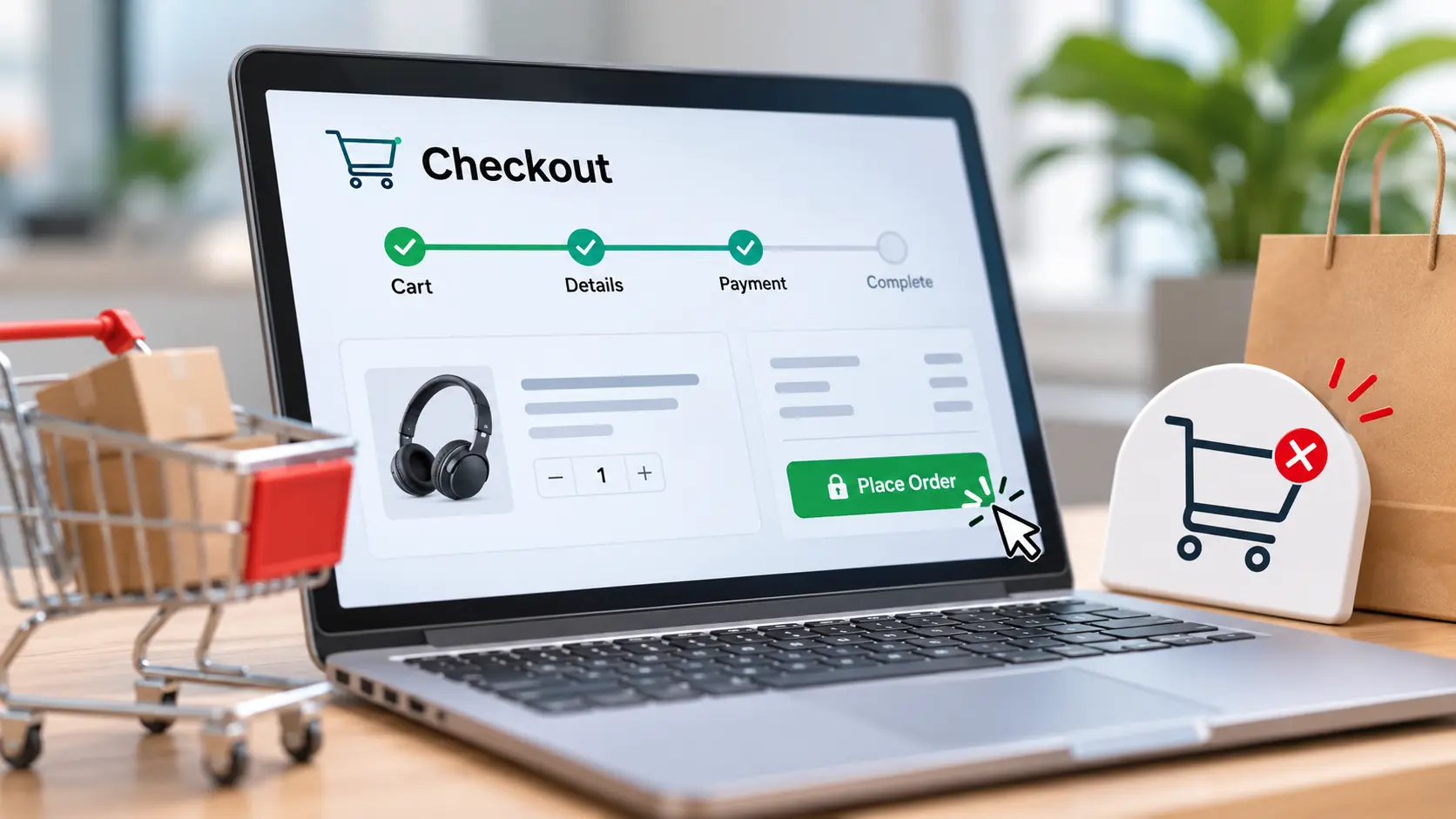
There’s a moment in every online sale that costs more than all the others combined.
Not the ad. Not the product page. Not the long browse where they compared you to three competitors. It’s the checkout at the last ten feet, where the customer has already decided to buy, the cart is full, the card is half out of the wallet…and then they leave.
That’s the most expensive loss in all of retail. You paid for everything: the ad, the SEO, the browsing, the deciding and then lost them at the register. They walked the whole store, picked the thing, got in line, and abandoned a full cart in the aisle because the queue annoyed them.
You already won. Your only job now is not to lose.
Here’s the mindset that changes everything about checkout.
A product page is a sales pitch. A checkout is not. By the time someone reaches checkout, the selling is over they already said yes. You cannot win a new customer here. You can only fail to close one you already won.
Which means ecommerce checkout optimization is almost entirely subtraction. Every field you remove, every step you cut, every surprise you eliminate makes you money. Nearly everything you add loses it. Stop trying to sell at the register. Get out of the way and let them pay.
Here are seven ways to reduce cart abandonment by doing exactly that.
1. Let them buy as a guest
The fastest way to lose a ready buyer is to demand they create an account first.
A first-time customer doesn’t want a relationship; they want the thing in their cart. Forcing registration is a wall between a willing buyer and your business. Offer guest checkout, collect only the email you need to send a receipt, and invite the account after the sale, not before. Never make someone sign up to spend money.
2. Show the whole price early
This is the single biggest reason carts get abandoned, full stop: unexpected costs at the end.
Shipping that appears at step four. A tax line that materializes after they’ve entered their card. A “handling fee” out of nowhere. Each surprise feels like a small betrayal, and betrayed people close the tab. Show the full price shipping, tax, everything as early as you can. The honest number, told upfront, keeps far more carts than a low number that grows at the finish line.
3. Make it fast, and make it work on a thumb
Most of your buyers are checking out on a phone, with one hand, on a patchy connection.
So speed and payment UX are the same problem. A slow checkout page bleeds buyers by the second. A form that’s fiddly on mobile tiny fields, a number pad that won’t appear, buttons too small to tap turns a ready sale into a frustrated exit. Test your checkout on a real phone, on real mobile data, as a real impatient human. Whatever annoys you there is costing you money.
4. Offer the payment they already trust
People are loyal to how they like to pay. Make them switch, and some won’t.
Offer the methods your customers actually use major cards, the digital wallets that let them pay with a thumbprint, and the buy-now-pay-later options like Klarna and Clearpay that a growing share of shoppers now expect. Every payment method you’re missing is a segment of buyers quietly clicking away to a store that takes their preferred one.
5. Prove it’s safe at the exact moment of doubt
Requesting for a credit card number amounts to requesting for a degree of trust, and it is at this very point that trust falters. This is where the power of signaling trust through various means at the time of check out comes into play, such as security seals, the padlock symbol, payment symbols, and a returns contact line. These signals may be small, but they come at the right place and time.
6. Show them the finish line
Uncertainty is friction. A checkout with no visible end feels like it could go on forever.
A simple progress indicator step two of three tells the buyer exactly how much is left and that it’s almost done. It turns an anxious, open-ended process into a short, countable one. People will finish a task they can see the end of; they’ll abandon one that feels bottomless.
7. Catch the ones who slip away
Some buyers will leave no matter what distracted, interrupted, comparison-checking. Don’t let the cart disappear with them.
Remember their cart so all they need is to make one click instead of having to search for everything again. Check their forms immediately so any mistake is corrected then and there instead of sending them back after everything is done. And a friendly reminder through an email will bring back many of those who left. A great checkout closes the sale; a smart recovery flow rescues the ones that nearly got away.
A preview from the front: the UAE
A glance at some UAE ecommerce tips shows where this is heading fast.
In a world where customers shop from their smartphones first, speak different languages, and like digital wallets and BNPL services, the merchants who succeed are those who have seamless, bilingual, and mobile-first checkouts with all the popular payment options in the local context. It’s a sharp preview of where every market is going: checkout is now a mobile, multi-payment, trust-first experience by default.
So here’s the move
Go buy something from your own store. On your phone. As a stranger.
Count the steps. Watch for the moment a price changes, a field annoys you, a flicker of “is this safe?” crosses your mind. Every one of those is a customer you’ve been losing a customer you already paid to win.
The store didn’t fail you. The register did.
Fix the last ten feet, and you keep the customers you already earned. That’s the cheapest ecommerce conversion rate gain there is: you don’t need more traffic. You just need to stop losing the people who already chose you.
They walked all the way to the counter. Let them pay.
FAQ
Why do customers abandon online shopping carts?
Perhaps the largest contributor to cart abandonment is that pesky surprise charge, be it shipping, tax, or additional fee at the point of purchase. Right after that come being required to register for an account, having a long or difficult checkout process, having limited payment options, concerns about entering credit card information, and frustrating mobile experiences. What do you notice? Each of those reasons involves friction, or loss of trust, at the precise point where the consumer had just committed to purchasing!
How can businesses improve checkout conversion rates?
Think of the checkout process as a subtractive one, not as a form of salesmanship. Give the choice of guest checkout, show total cost up front (shipping included), and ensure a fast and mobile-optimized experience. Provide trusted payment methods, such as digital wallets and buy-now pay-later schemes. Include a progress bar to give users a view of the end goal, and use autosave to avoid cart abandonment. The key philosophy here: get rid of any obstacle to clicking the “pay” button.
What trust signals should ecommerce websites include at checkout?
Put the message right where the doubts occur – at the payment stage. Provide security badges and the SSL lock symbol along with the logos of reliable payment providers (Visa, MasterCard, PayPal, Apple Pay, Klarna). The presence of a return and refund policy and a little reassurance regarding data protection also plays a role here. Customer testimonials or ratings near the cart do their job as well. All these little touches reduce the stress of providing card information and save customers from abandoning purchase.