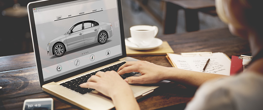
The Digital Showroom: How First Impressions Increase Sales
Buying a car in 2026 begins long before a customer steps foot in the dealership—demonstrated by the fact that the first step is purchasing the cars on their smartphones. If your customers encounter a slow or sticky digital front, they may leave without considering your inventory. Especially in the Middle East, driving (no pun intended) digital customer experiences with the best web designing company in Dubai is critical. You need more than a digital car photo gallery; you need a digital car buying experience that photographs customers.
Designing for the modern automotive industry is all about removing friction. Every click should bring the user closer to interacting with a vehicle and eventually making a purchase.
Essential Features for Modern Automotive Website Designing
Effective automotive website designing is about balancing a clean, luxurious user-facing site with the complexity of underlying technical data. Here is what your dealership needs to stay ahead of the curve:
- Mobile Friendly Automotive Site: Most car searches are conducted while on the go. Your site needs to be extremely fast and fully responsive, with the ability to quickly load high-quality images and detailed spec sheets.
- Infinite Scroll Product Listing: Users nowadays dislike having to click through “next” buttons to view more options. Using an endless scroll feature allows users to view more cars and stay engaged with your inventory longer.
- Save Favorite Vehicles Feature: Buying a vehicle is a huge commitment, and users value the option to save or ‘heart’ cars. This allows them to create a wishlist to return to, which significantly increases the chances of a return visit and a final sale.
- Automotive Website Navigation: Make it easier for users to jump to the ‘SUV’ or ‘Electric’ sections. Intuitive filtering options—like price, body type, and brand—are essential to any car dealership website UX.
- Auto Loan Repayment Calculator: Transparency builds trust. An integrated calculator helps buyers break down monthly payments and helps them reach their own conclusions about their budget before they ever approach you.
- Test Drive Booking Form: Make it incredibly easy for customers to take the next step. A simplified, one-click booking form can significantly increase your conversion rates.
Driving Conversions with Strategic Design
Automotive website design is best practicing the use of primary color schemed, high impact (big) CTA (call to action) buttons. These buttons need to facilitate the user journey in the direction of the desired action. In 2026 customers will expect to see and interact with parts of your website that otherwise may only be accessible in the physical dealership.
The Contribution of a Dubai SEO Company to Automotive Growth
You can have the most beautiful digital showroom in the world, but it’s useless if it’s parked on a dead-end street. Visibility is the fuel that drives traffic. A specialized Dubai SEO company ensures that if a potential customer searches for a specific make and model or “best car deals in UAE,” your digital dealership is the first one they see.
Investing in a contrarian approach to SEO will optimize your VDPS (Vehicle Detail Pages) in particular, and drive search visibility to your dealership in the process. When the design is world class and the website is aggressively optimized, these are the conditions that help change the automotive brand for the desired end impact.

