Brilliant
Responsive Website Design Services
Company in Doha, Qatar
The key criteria for responsive web development is to ensure that any content can be displayed on any device, regardless of the device width, pixel density and other specifications. With our services for responsive website design in Qatar, you may uncover the soul of a dynamic online presence. Responsive Website Designing that are both aesthetically pleasing and easy to use are our forte here at RedBerries, and we make sure they work perfectly on any device. Your online presence needs to be eye-catching, interactive, and conversion-driven; our team of experts can make that happen for any type of business. So, transform your brand with our cutting-edge strategy for responsive web designing right away.
Certified Google Partner Agency Based in Qatar.

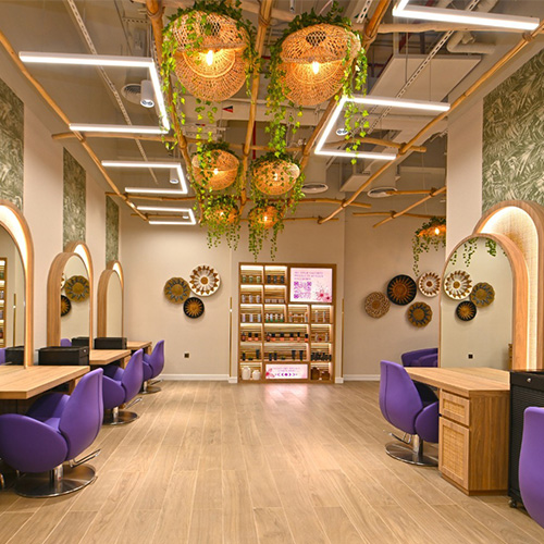
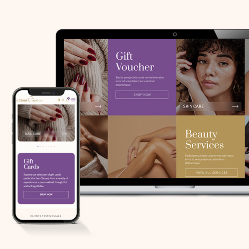
Tips & Toes

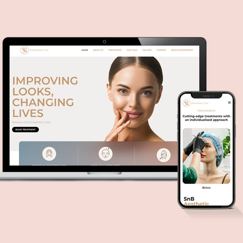
SnB Aesthetics


kayway


Lingo


Isuzu
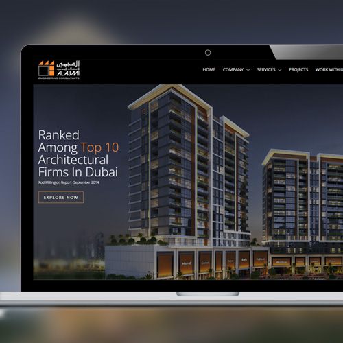
Al Ajmi Engineering Consultants
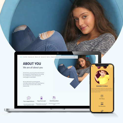
Snö Dental Clinics

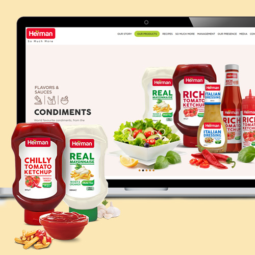
Herman Foods

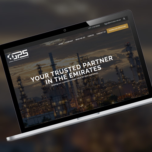
General Petroleum Services
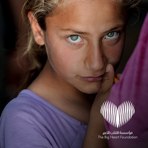
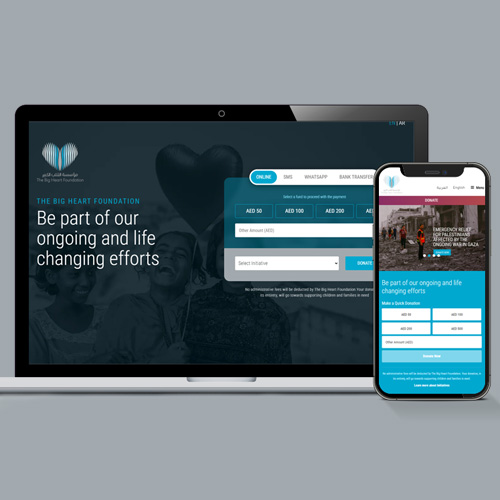
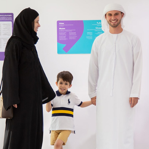
The Big Heart Foundation


Liger


Parham Ramezani


Ineos Granadier


ASM Boats

