Responsive
Website Design Services Company
in Manama, Bahrain
Using Redberries responsive web design solutions, your company can construct a site that is easy to read and view for its users-visitors on various devices. Excessive scrolling, unpleasant layouts, and non-adaptive graphics will not sway them.
Certified Google Partner Agency
TAKE ADVANTAGE OF A COMPLIMENTARY CONSULTATION
Until recently, internet use was limited to those with a single screen, such as desktop or laptop computers. Nowadays, the average internet user uses a variety of devices like a smartphone, a tablet, and a desktop computer to get online. Websites must be able to adapt to a variety of platforms to give their customers a seamless experience. Glass walls that become more opaque when people enter the room are an example of responsive architecture, which is where responsive web design gets its inspiration—designing web interfaces for a range of platforms like Windows, Android, iOS, and so on would be exceedingly difficult, if not impossible, for a company.
Glimpse of Our Web Designing Works
where artistry meets web design to create unforgettable online user experiences.
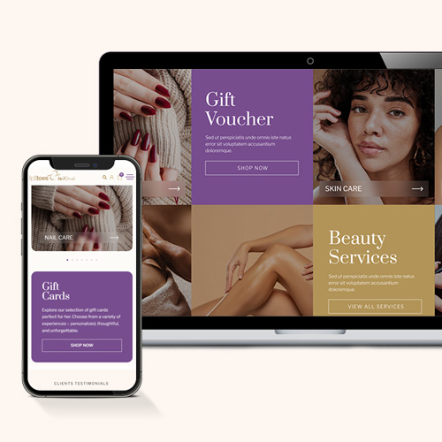
Tips & Toes

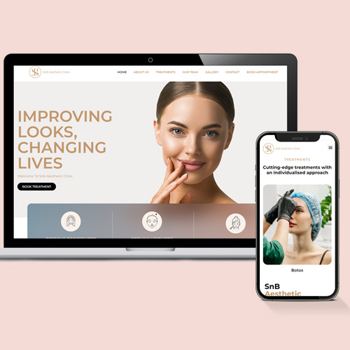
SnB Aesthetics


kayway


Lingo

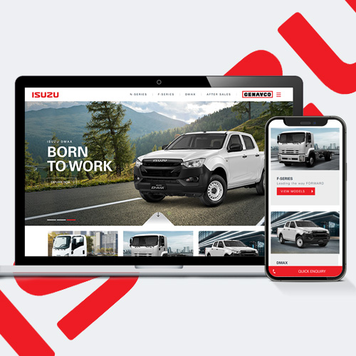
Isuzu

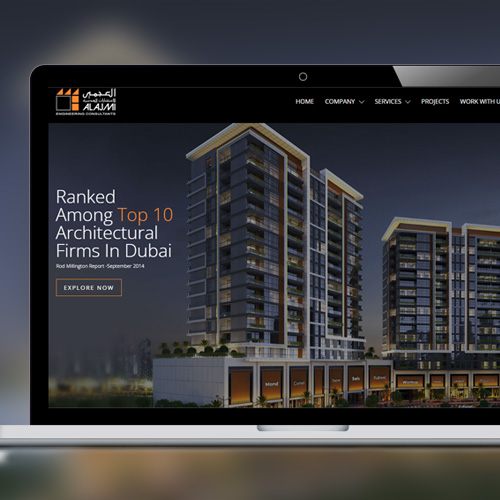
Al Ajmi Engineering Consultants
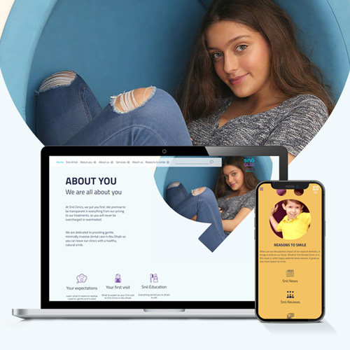
Snö Dental Clinics

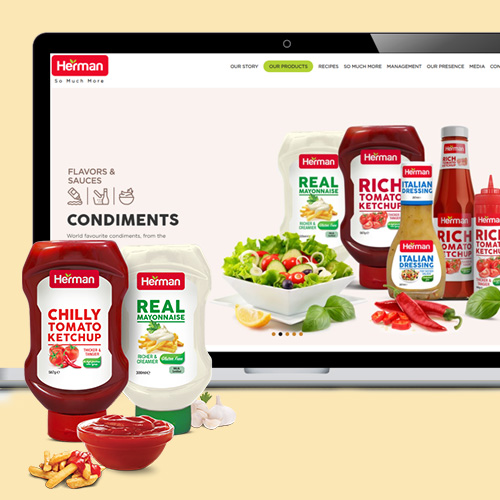
Herman Foods


General Petroleum Services

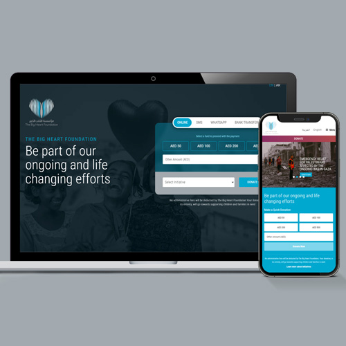
The Big Heart Foundation

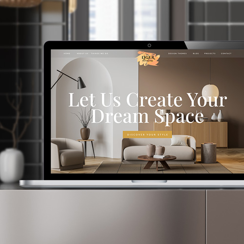
Liger


Parham Ramezani


Ineos Granadier


ASM Boats


EM Normandi

Redberries develops responsive websites based on responsive web design principles such as the ones listed below:
Screen resolutions that can be adjusted
Images that can be resized
Grids that can be reconfigured easily
Ajax-based CSS3 Media Queries
Mobile traffic now accounts for the majority of all internet traffic, making responsive websites a need rather than a luxury. Web responsiveness is taken into account by Google in its results, and non-responsive sites are de-emphasized.
Agency for a Resilient Website
A responsive web design (RWD) that works on any device is critical in today's ever-changing digital landscape (mobile, tablet, desktops, etc.).
Because of this, a typical website now has to meet more demanding standards. A mobile-friendly website is no longer an option; it is a need if you want to see your business expand.
Bahrain's Most Effective Responsive Web Design Company
A responsive website's greatest challenge is its compatibility with a wide range of operating systems, display orientations, and other variables. There are far too many devices and operating systems on the market to build a responsive website for them all.
Red Berries understands this, and our team offers you a solution compatible with the most commonly used hardware and operating system configurations. The majority of consumers may enjoy a seamless user experience with your business because of this.
Methodology of Responsive Web Design
We know just how to keep your clients happy. We give your company tailored solutions that yield a significant return on investment (ROI). As a result of our knowledge of the digital marketing environment and our commitment to staying abreast of new technological developments, we have achieved this.
Web Design Concepts for Mobile and Tablet Devices
When it comes to responsive design, the way content appears on a website is critical. Concerning screen size and resolution, the material should be presented appropriately no matter the device's orientation, pixel density, operating system, or web browser specification. This is critical because if the material isn't displayed correctly, visitors may leave your website.
The following are some advantages of having a mobile-friendly website:
A visually appealing website that can be seen on virtually any mobile or desktop device.
Image dimensions aren't displayed correctly on some devices because of custom codes; on others, they work fine.
To accommodate varied website designs, our team creates sturdy coding.
Create distinct web pages for different types of devices.
There is no need to construct multiple versions of the same website if RWD is established. Publishing less information is made more accessible by using this method, and it's also flexible. Because it can adapt to different devices without building multiple websites, this promotes brand continuity.


Future Designs Compatibility: The best method to create an RWD is to follow current web standards and to write lean, agile code that can be adapted to new devices in the future. When designing responsive websites, don't only think about today's devices; keep in mind tomorrow's as well.
Concepts Focused on Mobile Devices
The way people navigate the internet has undergone a sea change. Online shopping and browsing have shifted from desktops and laptops to mobile devices in recent years. In part, this results from people's preference to do their browsing or shopping while on the move. The first thing we do at Red Berries when building a new website is the mobile user's journey.
Web Responsiveness (RWD)
Responsive websites allow visitors to seamlessly go from a desktop to a mobile device without making any modifications to what they see. Responsive websites will automatically change their presentation style to fit a variety of screen sizes and resolutions. When it comes to search engine optimization and speeding up the website, we are here to help!
Responsive Websites Have These Important Features.
Design width and orientation are just a few examples of how web developers might customize a media query layout to better suit their needs. As a result, we're in a better position to make adjustments and build a more responsive website. It all comes together to create a visually appealing website that can be accessed from any device.
If you're looking for flexibility in your website's design, our team has you covered. No matter what size screen you're using, the website will automatically reorient itself to provide you with the material you want to see. This strategy is beneficial for future website changes as well. Overall maintenance costs are decreased because modifications are only made to one version of your website.
Using Viewport meta tags, site designers can prepare web pages for different devices by adjusting page sizes and using a different layout. For the device to work with any web browser, a little bit of code is embedded in it.
Facts about Redberries: The number of individuals who use the internet from their mobile devices is likely to double in the next several years. Use Redberries responsive websites to make your website as appealing as possible across a variety of interfaces.