Trustworthy
Responsive Websites Designs Services
Company in Muscat, Oman
12 YEARS OF CREATIVE WEB DESIGN & STRATEGIC DIGITAL MARKETING
The digital landscape is dynamic in nature and you have to adapt to it on a constant basis to grow your client base. Websites are the way to show your presence globally.
Certified Google Partner Agency.

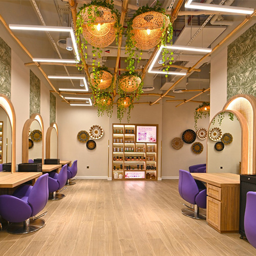
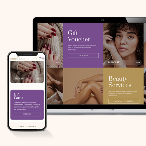
Tips & Toes

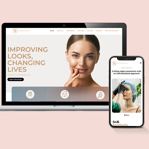
SnB Aesthetics

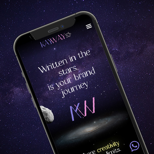
kayway
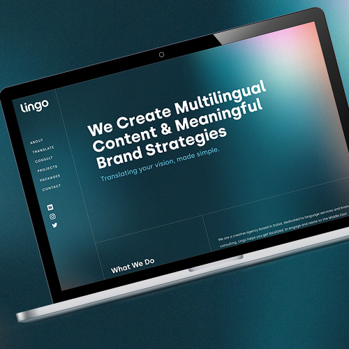
Lingo
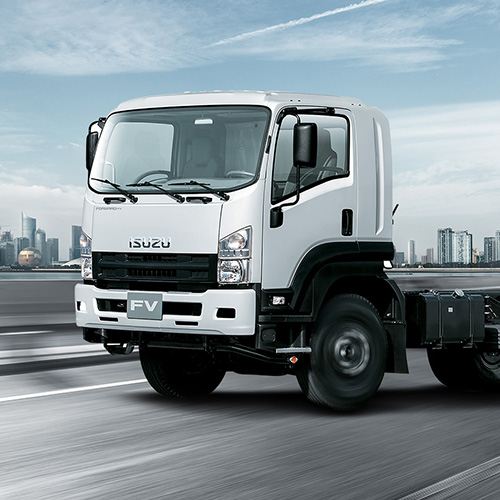
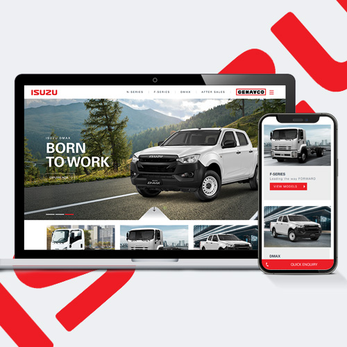
Isuzu
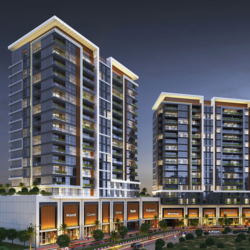
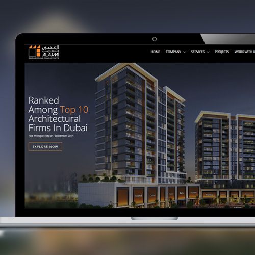
Al Ajmi Engineering Consultants
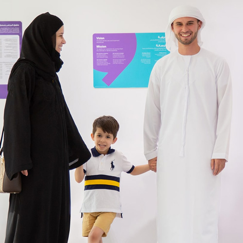
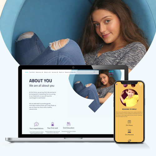
Snö Dental Clinics

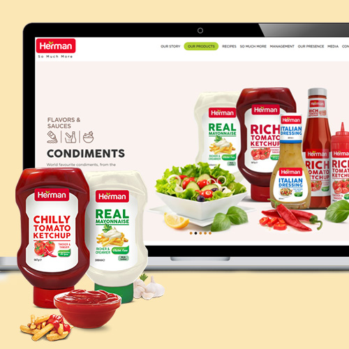
Herman Foods

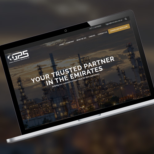
General Petroleum Services
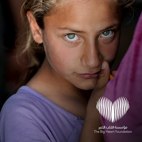
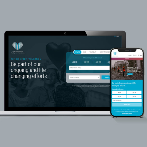
The Big Heart Foundation
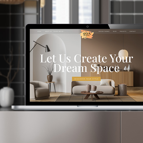
Liger


Parham Ramezani


Ineos Granadier


ASM Boats

